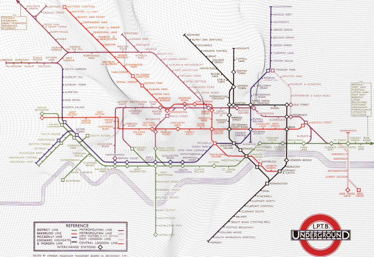
Geographic Map Distortions

I’ve long been fascinated with transportation maps, and in particular the revolutionary re-design of the london-underground map by Harry Beck in 1933. In his iconic design, which has since been adopted by most transportation maps, Harry Beck deliberately sacrifices geographic accuracy for visual clarity of information - by using equally-spaced stations on straight lines with only 45/90 degree bends.
In this Wolfram Community post, we investigate how the local coordinate system is additionally distorted through the years as more stations get added to display the information more clearly.
